

Should your landing page be a stark, white-space-dominated minimalist canvas, or a bold, high-energy maximalist editorial experience?
In modern web design, there is no single "correct" aesthetic. The ideal visual direction depends entirely on your product's positioning, target audience, and price point.
Let me break down when to use Minimalism versus Maximalism to maximize your conversion rates.
1. The Minimalist Landing Page Approach
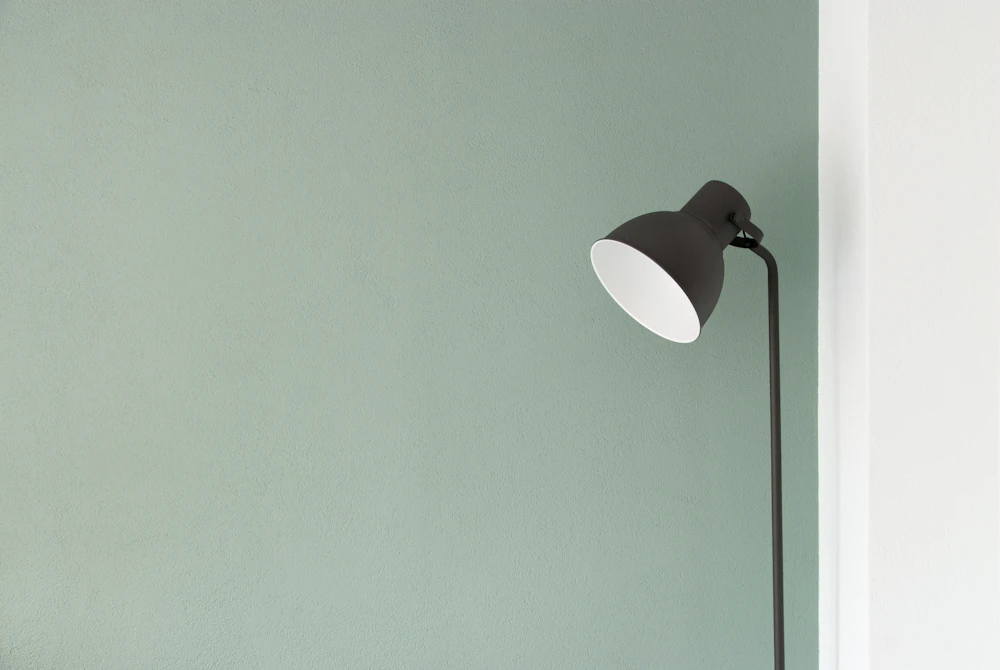
Minimalism is built on the principle of "Less, but better". It strips away non-essential visual elements to focus 100% of user attention on a single core offer.
Key Characteristics of Minimalist Pages:
- Generous white space (or Soft Cream canvas space).
- Single, highly-focused call to action (CTA).
- Minimal navigation options.
- Crisp sans-serif typography with limited color accents.
Best Suited For:
- Developer Tools & Infrastructure API products (e.g. Stripe, Vercel, Supabase).
- High-Ticket Luxury Products where restraint signals elegance.
- Single-Item Lead Magnets (Ebook downloads, waitlist registrations).
2. The Maximalist Editorial Approach
Maximalism is not about chaotic clutter—it is about Rich Storytelling, Bold Contrast, and Expressive Typography.
Key Characteristics of Maximalist Pages:
- Bold editorial headline typography (Playfair Display).
- High-contrast visual grids and physical
4pxoffset shadow boxes. - Rich content variety: embedded video demos, interactive ROI calculators, customer quote carousels, and detailed feature breakdowns.
- Vibrant color accents (like Terracotta
#E25822and Electric Gold#FFD700).
Best Suited For:
- Comprehensive B2B SaaS Platforms requiring deep feature explanations.
- Creative Agencies & High-Growth Marketing Tools.
- Consumer E-Commerce & Subscription Brands.
3. Comparison Matrix: Minimalist vs Maximalist
| Feature | Minimalist Approach | Maximalist Editorial Approach |
|---|---|---|
| Primary Goal | Instant Clarity & Friction Reduction | Deep Storytelling & Trust Building |
| Average Reading Time | 30s - 60s | 2m - 4m |
| Ideal Price Point | Free / Low Friction | Medium to High Ticket |
| Typography Focus | Ultra-clean Sans-Serif (Inter) | Editorial Serif + Mono + Sans-Serif |
Conclusion
Whether you choose sleek minimalism or expressive editorial maximalism, the key is consistency. A half-baked hybrid page confuses visitors and destroys trust.
Explore both minimalist and editorial landing page templates on LandingPro.


